In the latest in our series of guides showing you around your new and improved Recruiter dashboard, we’ll be demonstrating how you can use your dashboard to spot key trends in your jobs’ performance.
Recent Report
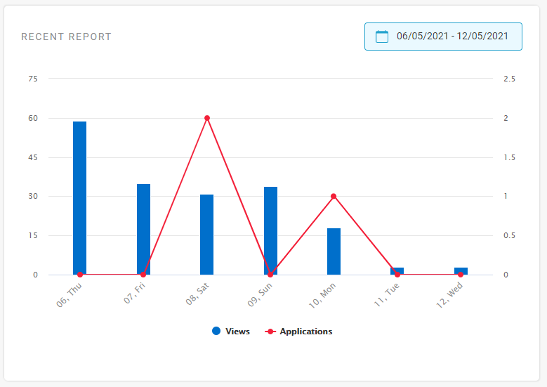
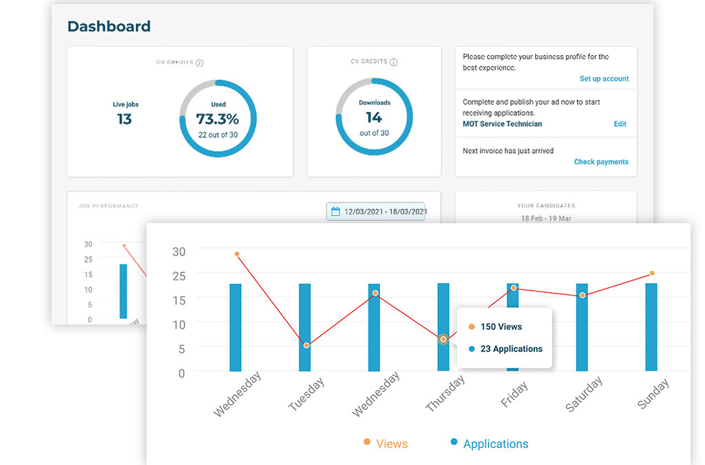
The Recent Report graph is visible just below your current job and/or CV credits on the left of your dashboard, and gives you a snapshot of your jobs’ recent performance.
The blue bars on the graph indicate the total number times your jobs have been viewed, and the red line indicates the total number of applications your jobs have received. See the left hand side of the graph for more context on the actual number of views, and the right hand side of the graph for the actual number of applications.

Use the date selector above the graph to choose which timeframe you’d like to look back at. The graph will show you day-by-day stats, unless you choose a longer timeframe such as “last 30 days” or “last month” in which case you’ll be shown your stats on a week-by-week basis.
We recommend that you keep an eye on the Recent Report to help you spot trends that can help give context to your jobs’ performance. For example, monitoring which days of the week your jobs tend to perform well on can help inform when may be best to post future adverts. Or, if you have made any recent changes to your adverts, this section can help you spot whether these changes have had a positive impact on your applications.
Job Performance
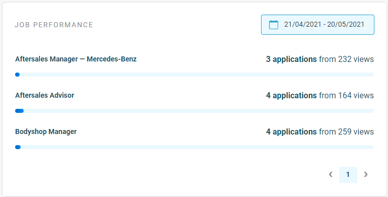
Underneath the Recent Report you’ll see the Job Performance area. This section gives you a breakdown of your views and applications on a job-by-job basis, giving you a closer look at where exactly your applications are going.

The blue bar underneath each job is designed to give a visual indication of how well each job is converting views into applications, helping you spot any potential issues which may be hindering certain jobs’ performance – and highlighting which jobs are your best performers. These insights can help you make future decisions about your adverts in order to replicate what has worked well before.
Again, use the date selector at the top here to change the time frame you want to look back over. Any jobs that were live during your selected time period will be displayed in this report, so don’t worry if you want to check a particular job which is no longer live; as long as it was live during your selected timeframe, you’ll be able to look back on its performance.
Performance Comparison
The Performance Comparison area to the bottom right of your dashboard gives you a benchmark as to how your jobs are performing in comparison to other recruiters on our site, giving you some wider context and reassurance as to how your jobs’ recent performance falls in line with industry trends.
This report looks back over the last 30 days, comparing your jobs’ average conversion rate (from views into applications) to the average conversion rate amongst all recruiters on the site. You’ll be shown a percentile here demonstrating where your performance sits in relation to the rest, helping you spot whether any action may be needed to improve this.
Clicking on “Full Performance Metrics” here will take you into your Reporting area, which is where you can take an even closer look at the factors influencing your jobs’ performance. We will provide a full guide to the Reporting area in an upcoming article, so keep an eye out for this!
Manage Your Job Adverts All in One Place
Next in our series of guides to the new and improved features of your Recruiter account, we’ll be showing you around the Jobs Area. You can access your Jobs Area via the main navigation menu on the left hand side of your dashboard; this is where you’ll be able to...
Track Account Usage & Applicants in Your New Dashboard
Welcome to your new InAutomotive dashboard! In the first of a series of guides showing you around the new and updated features of your Recruiter account, we’ll be taking you through the main areas of your dashboard and demonstrating where to find key information on...


